Avendus: Brand Transformation & Environment
Experience the next level of excellence
Avendus is a leading new-age provider of financial services with an emphasis on customised solutions in Investment Banking, and more. As the company pushes boundaries in empowering high performing entrepreneurs, wealth creators and pioneers of the new age economy, the objective was to transform and realign their brand and culture.
Taking Inspiration from risk taking and action making we developed a brand exercise that would translate their brand essence “next is the only level”.
Redefining brand identity with a bolder logotype defines the confidence that the brand has while taking significant business decisions. Professionals and modern, the new type is more legible and readable, essential to built a powerful brand.
The inseparable symbol of caret ‘^’ perfectly frames the progressive attitude of the brand. A wider form of the caret implies the broad-based solutions, yet aspiring to achieve exponential heights in the markets and sectors they operate in.
Challenge
To mirror progressive and dynamic ethos of Avendus with their culture.
Approach
Transform the brand culture into a centre of achievement, excellence and competition, fuelling team sprite to reach for the the next level.
To mirror progressive and dynamic ethos of Avendus with their culture.
Approach
Transform the brand culture into a centre of achievement, excellence and competition, fuelling team sprite to reach for the the next level.
Set of abstract symbol based diagrams were developed to extend the identity further, keeping the core essence of “next Level”. Every piece of abstraction depicts a metaphor for risk, action and the act of rising to the occasion.
The office design, was envisioned to be an achievement centre. Each zone was crafted with a distinctive language that fuelled team-spirit to reach for the next level.
Catalysing spaces to reflect the culture
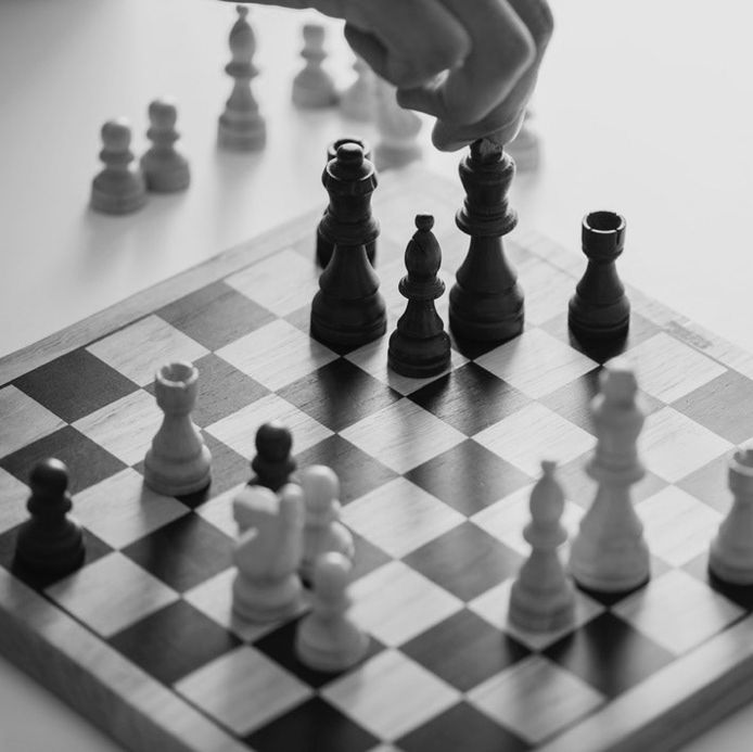
Spaces were carved to inspire teams and breathe in their culture. A fun and interactive new way was tossed around indoor games but created a completely new mix. Each space became a catalyst to fuel the spirit of challenge to drive the team to the next level. Life sized installations mirror the values of excellence cherished at Avendus.
Brain teasers were used as a creative and emphatic touch, encourage clients and visitors to absorb, play with and become a part of their brand culture.


Un-scrabble the mind
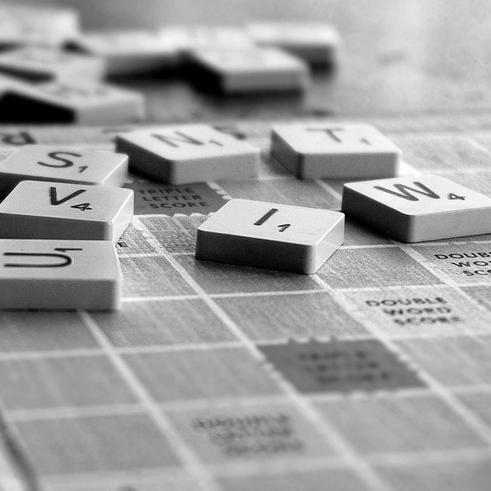
The meeting room design was inspired by the game of scrabble, where resourcefulness and inventive thinking come together with a dose of fun and tease. All this while, constructing something valuable and meaningful.
Let's go LEGO
The metaphor of a Lego game came alive to harness the power of one for all and all for one. Pieces came together to form a strong base to serve as a launchpad for the future.
Un-blocking imagination
It was a revival of the charm of playing with alphabet blocks as an entire wall was built on it. The canvas was thrown open for people to form their own words, own rules and definitions.
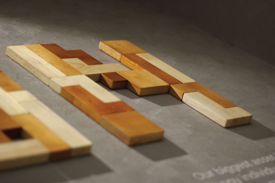
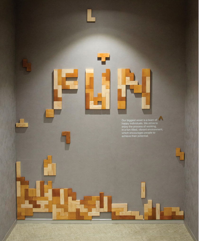
Building fun
It was a revival of the charm of playing with alphabet blocks as an entire wall was built on it. The canvas was thrown open for people to form their own words, own rules and definitions.


Burp goes the day
Café Burp at the office premises declared itself as a happy place from the word go. From its stamp logo to its black and white graphics, everything spelt fun and joy in every, well, burp.
