Lokmat: Brand Environment Design

Reinforcing the power of voice at work
Voice is a powerful medium. At Lokmat, the largest read regional language newspaper in India and the No.1 Marathi newspaper in Maharashtra & Goa states, voice is also a mission. Its aim to enrich lives by educating, informing, voicing and entertaining its reader in the smallest nook of India, is not just a powerful statement. It is a reason for being.
Voice is a powerful medium. At Lokmat, the largest read regional language newspaper in India and the No.1 Marathi newspaper in Maharashtra & Goa states, voice is also a mission. Its aim to enrich lives by educating, informing, voicing and entertaining its reader in the smallest nook of India, is not just a powerful statement. It is a reason for being.
Challenge
Envision Lokmat at the centre of empowerment and stay true to the leadership stance.
Approach
Build a culture that encourages individual voice and inspire people to lead from front
Envision Lokmat at the centre of empowerment and stay true to the leadership stance.
Approach
Build a culture that encourages individual voice and inspire people to lead from front
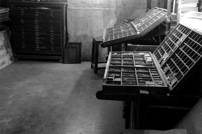
Paying homage to the traditional method print & publishing
The new office environment was designed as a tribute to traditional information gathering, processing, and publishing techniques such as letterpress or offset printing, type-setting, and pagination. As the carriers of the voice that Lokmat is synonymous with, they became central to the theme that revolved around translating each design concept based on these authentic techniques. It not only emphasised the role of an individual in creating a compelling outcome, but became a metaphor and inspiration to craft that voice.
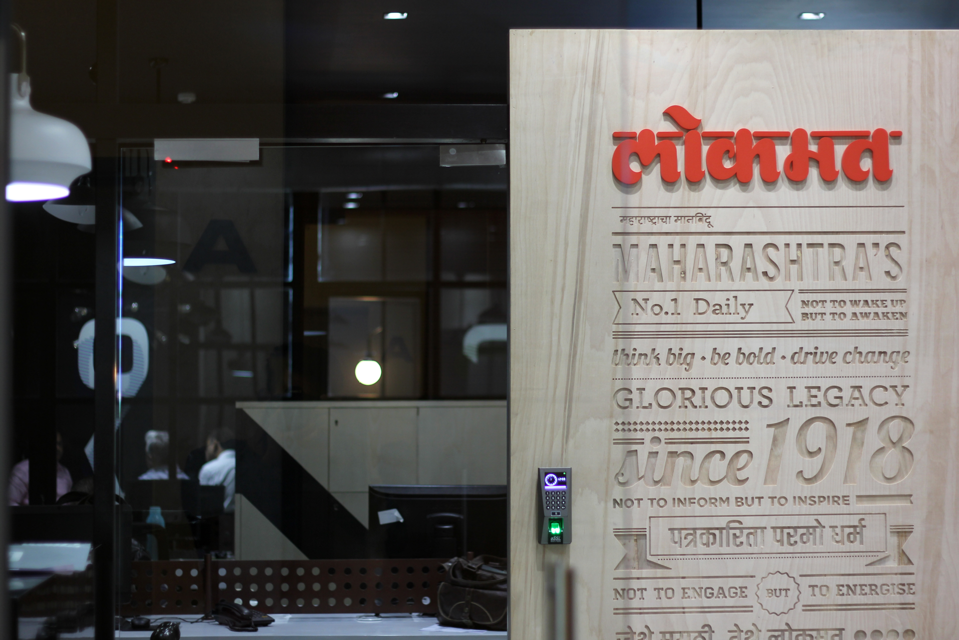
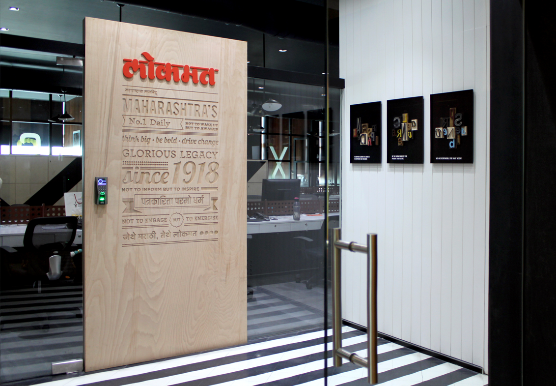
Carving out the legacy
The welcome wall was built as testimony to the journey of Lokmat, its legacy and values, its ideologies and impact. Even as the wall captured key philosophies of the brand, it also reflected its brave vision for tomorrow – the embossed wooden panel stood for capturing timeless truths, as strongly as it stood for carving a way ahead.
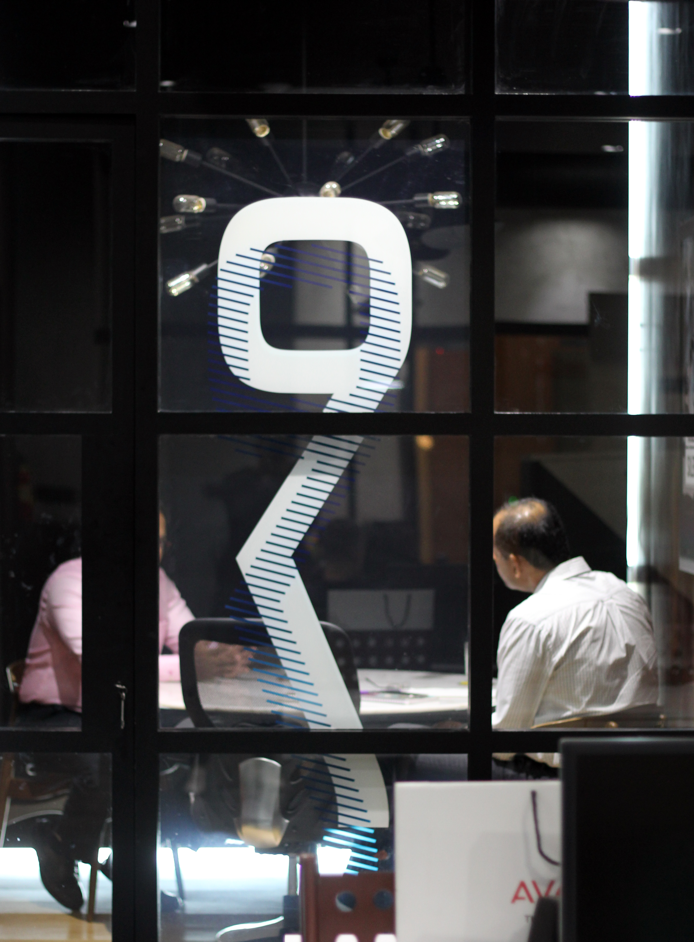
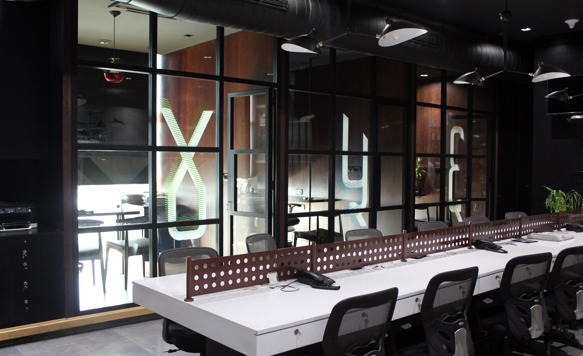
Going back to the roots with local pride
As a powerful reflection of local pride, the treatment used Devnagari life-size numerals to connote cabins. On the other hand, the contemporary visual treatment gave it an urbane and lateral look. All the while, the structure used a column grid that was directly inspired by the pagination technique.


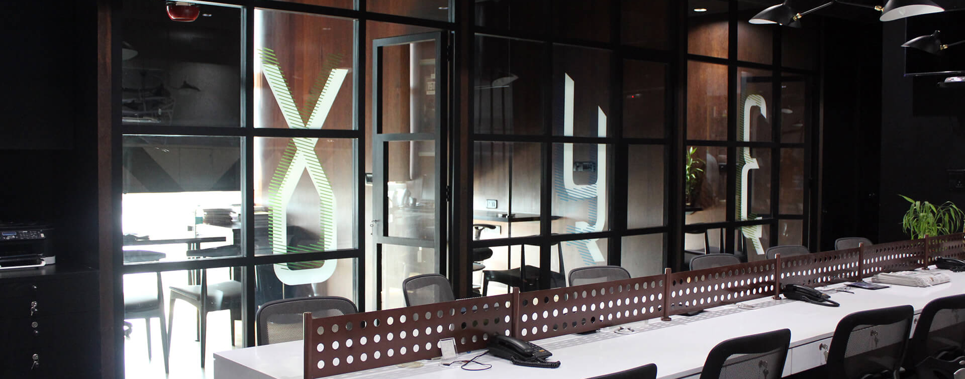
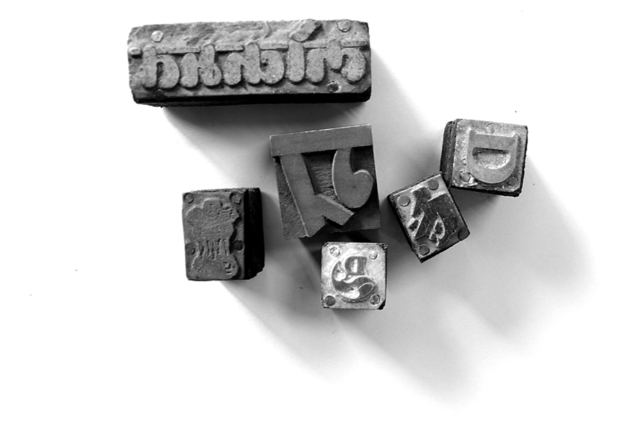
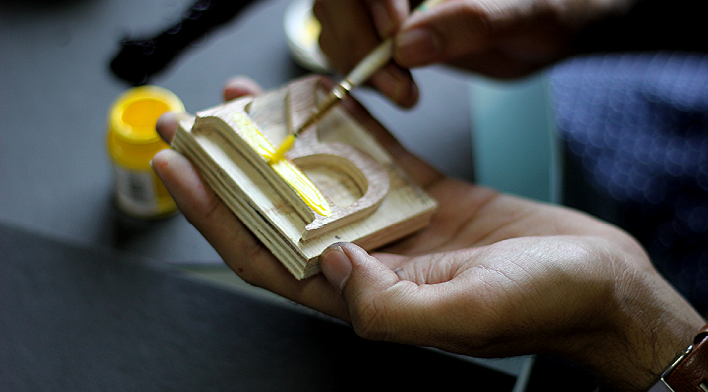
Celebrating the traditional method of letterpress
Celebrating and paying homage to the erstwhile letterpress printing technique, the iconic technique was recreated at its inspired and impactful best. Letterpress alphabets became the perfect vehicles to express the brand values and communication.
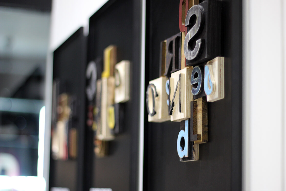
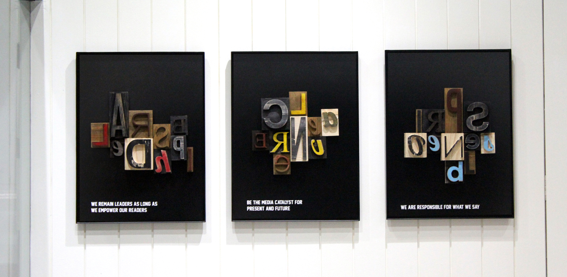
Gathering the voices together
Celebrating and paying homage to the erstwhile letterpress printing technique, the iconic technique was recreated at its inspired and impactful best. Letterpress alphabets became the perfect vehicles to express the brand values and communication.


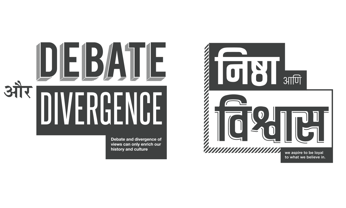
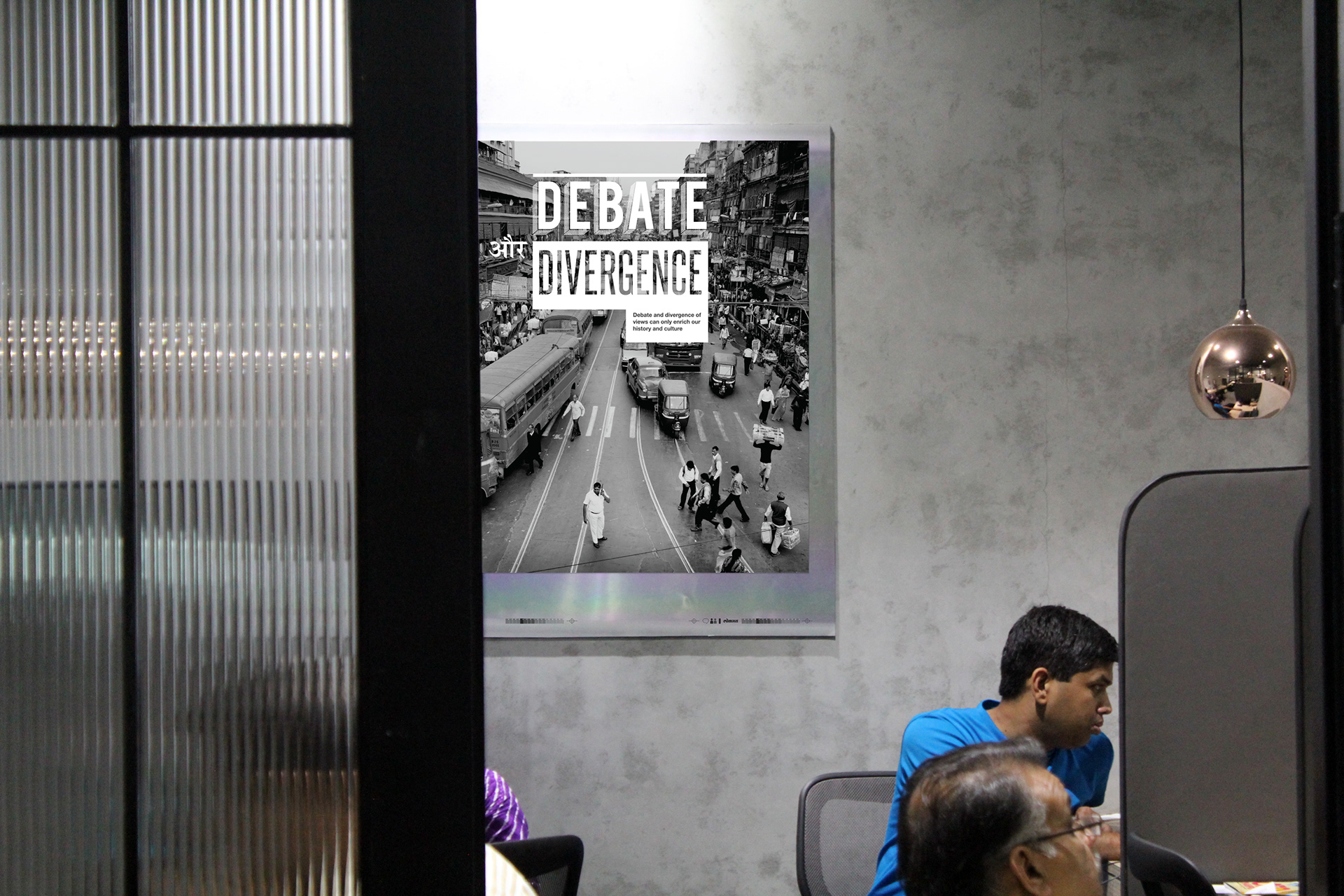
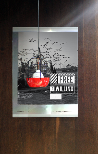
Portraying the belief
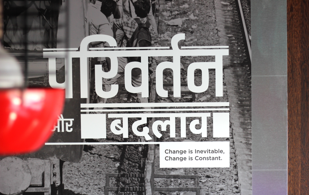
Communicating the voices of the people behind Lokmat, through posters that were woven around enriching lives, empowering people and the principles surrounding it. Combining photography with text, the design inspiration was taken from the editorial design of magazines and their layouts. The brand messages were rendered on actual offset printing plates, providing the backdrop of a processing house and becoming reminiscent of the editorial space.
Upholding the quintessential vision
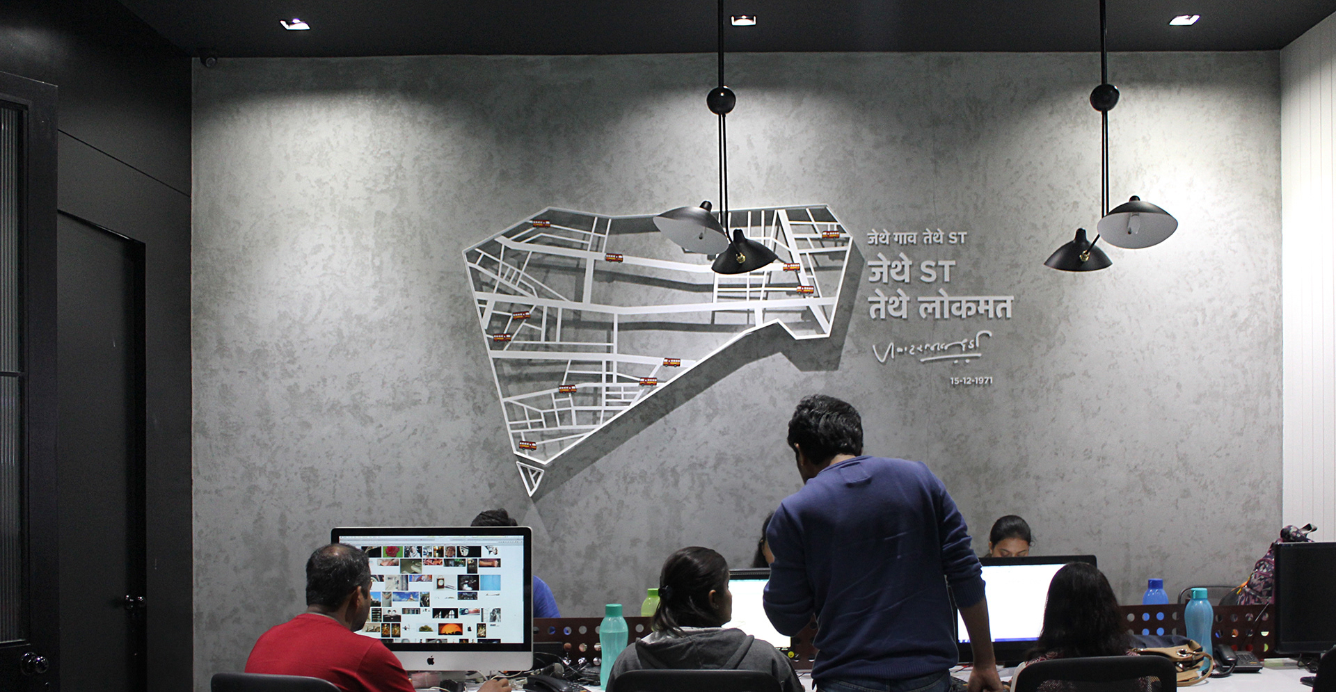
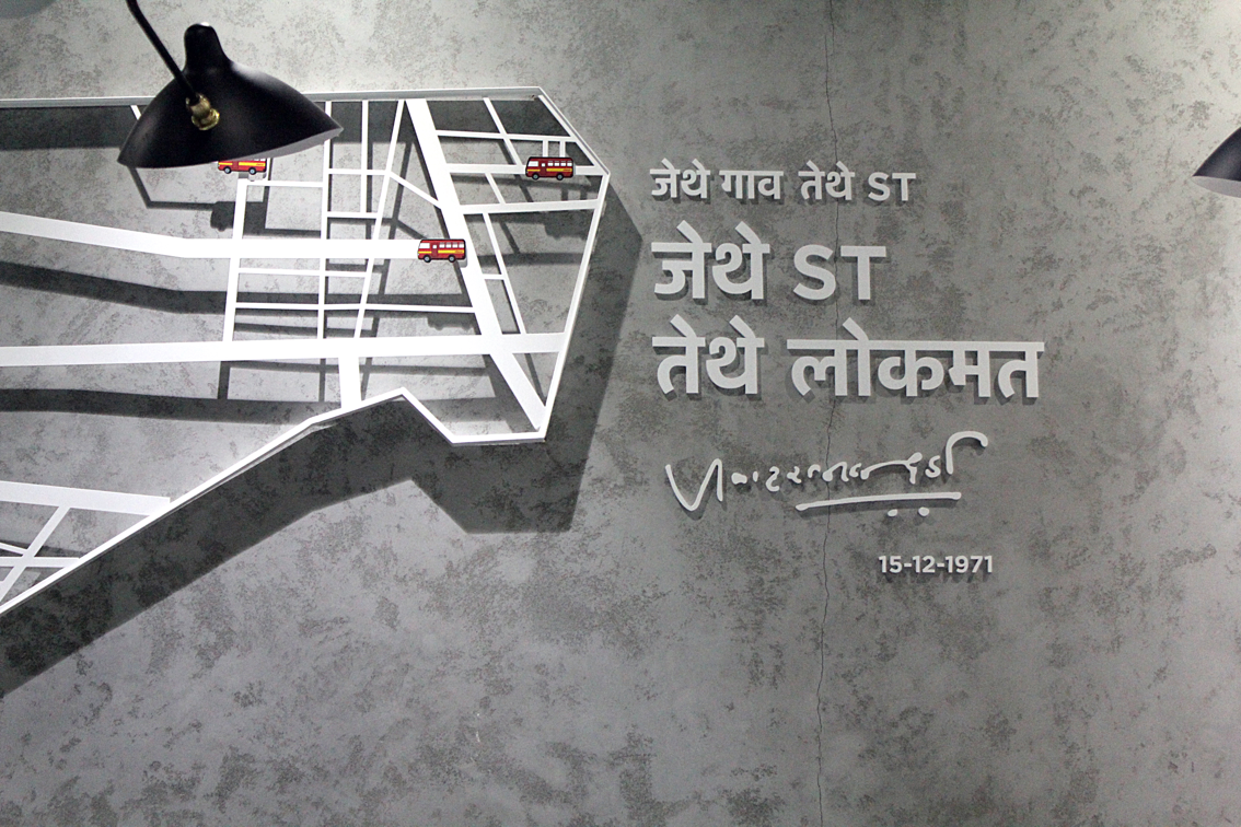
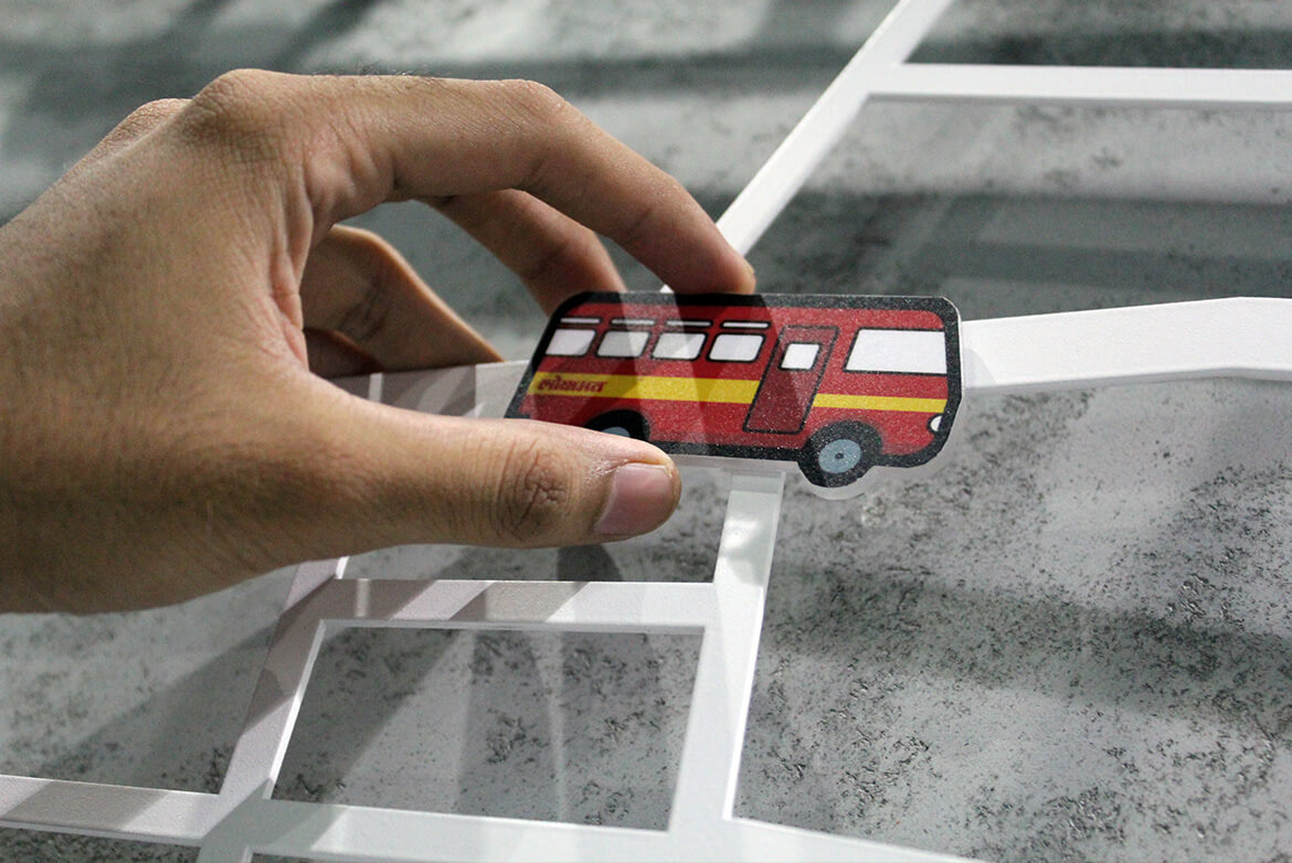
Today the influence of Lokmat goes beyond classes, boundaries and people – this was the vision of the great Shri Jawaharlal Darda, founder of Lokmat. To showcase its powerful reach encapsulated in the tagline “Jithe ST, tithe Lokmat”, a wall that traced the journey of the brand was installed . Movable ST bus magnets added a delightful element of interactivity and play to the engaging installation.
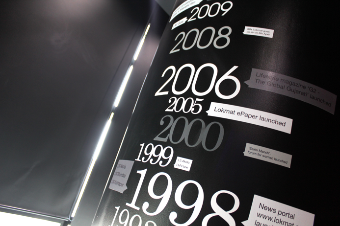
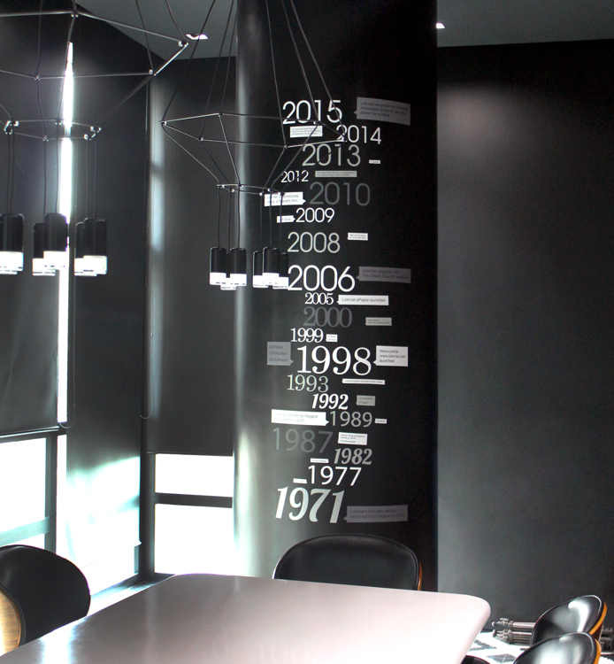
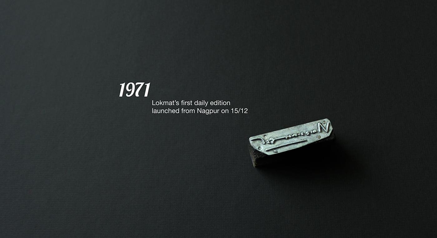
Capturing the journey so far
A distinctive pillar design captured milestones in the glorious journey of Lokmat - fitting end to memorable journeys, inspiring start to new ones.