Reliance: Brand Environment Design
Diversity to inspire a unified experience
Reliance Anil Dhirubhai Ambani Group is an Indian conglomerate, headquartered in Navi Mumbai, India. A melting pot of people, perspectives, potential and performance, the Company celebrates its diversity at different levels, including its workspace. This is where businesses and people grow, expand and progress as one. As the company moves towards a fluid and broader outlook, it approached us to redo their spatial branding to reflect the shift.
Reliance Anil Dhirubhai Ambani Group is an Indian conglomerate, headquartered in Navi Mumbai, India. A melting pot of people, perspectives, potential and performance, the Company celebrates its diversity at different levels, including its workspace. This is where businesses and people grow, expand and progress as one. As the company moves towards a fluid and broader outlook, it approached us to redo their spatial branding to reflect the shift.
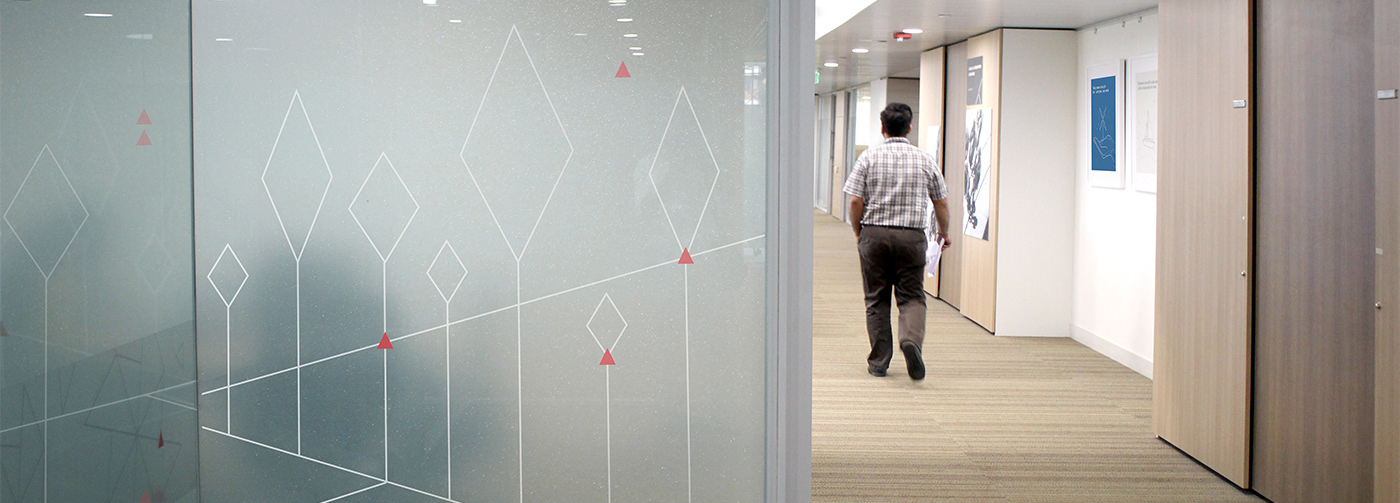
From here, emerged a fresh new brand language that tossed around established brand colours and fonts, but created a completely new mix. Each design element developed a visual metaphor to define, grow and enhance the brand, while making a memorable, positive impact on employees. The new look was a mirror to the global, collaborative and dynamic side of the Company – a companion on the way forward.
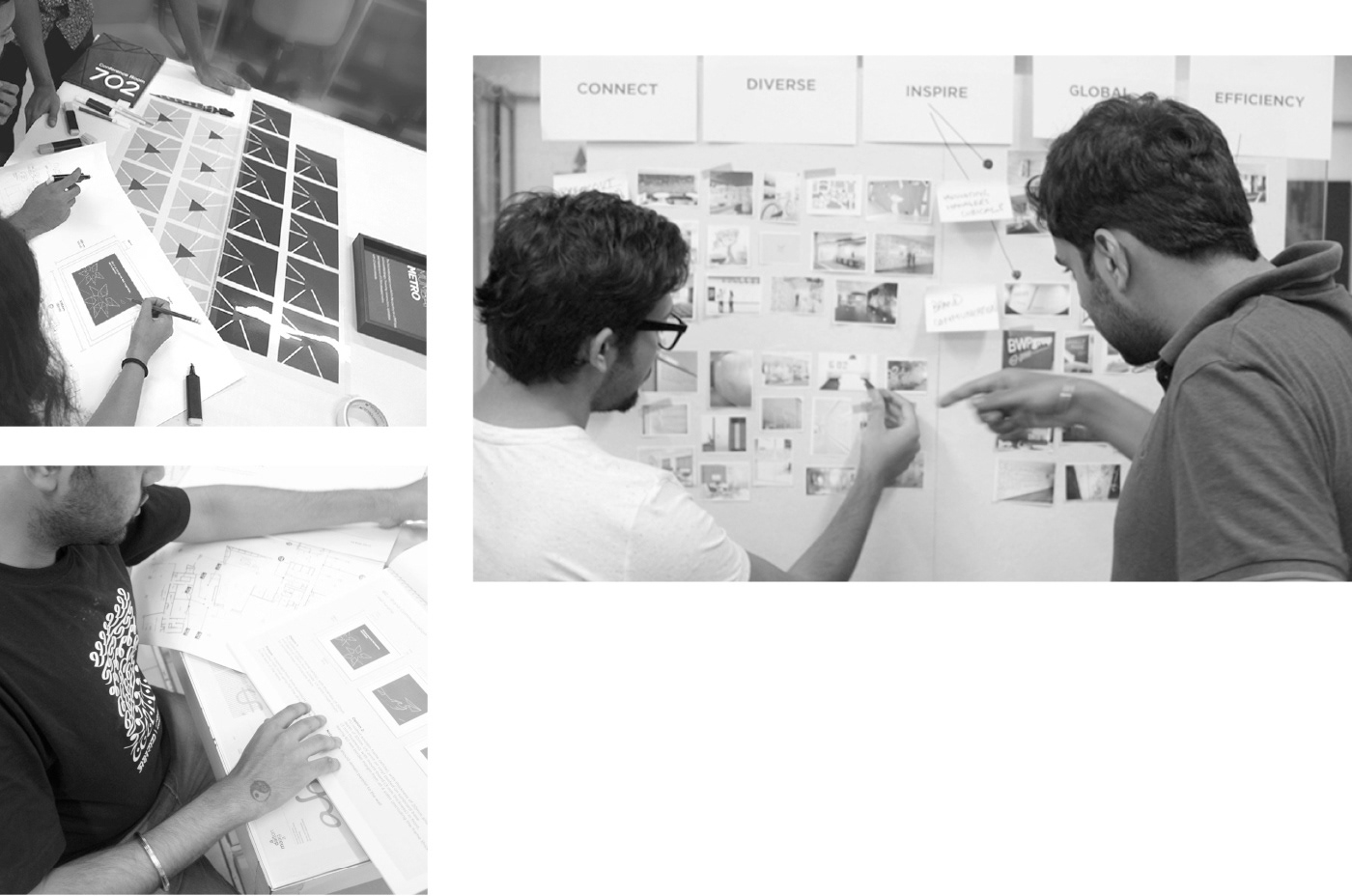
Challenge & Approach
Reliance ADAG is a massive and diverse corporate with different verticals. Our key challenge was to bring in harmony and unite these varied aspects through the environment. We wanted to break the basic corporate approach and move towards an open and flowing outlook. All our designs stemmed from this basic premise.
Visual Simplicity
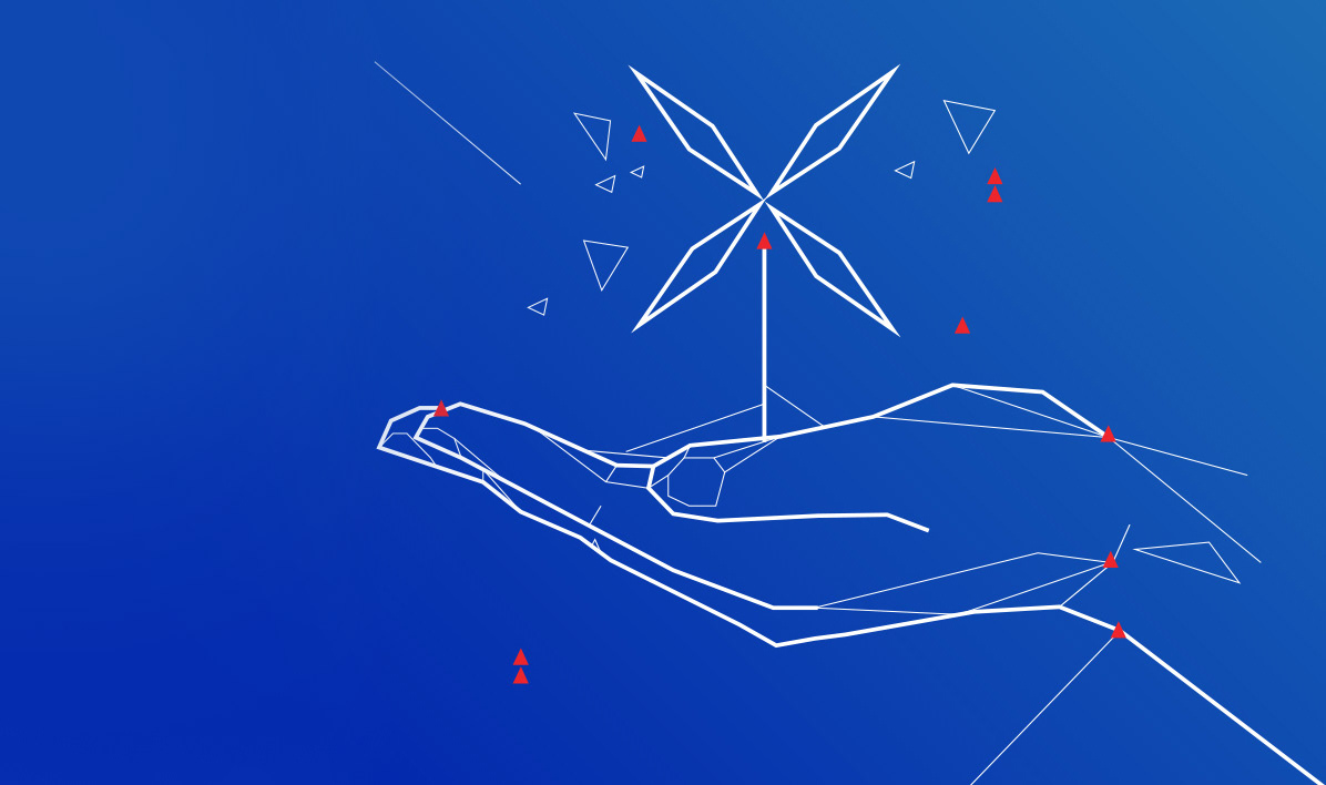
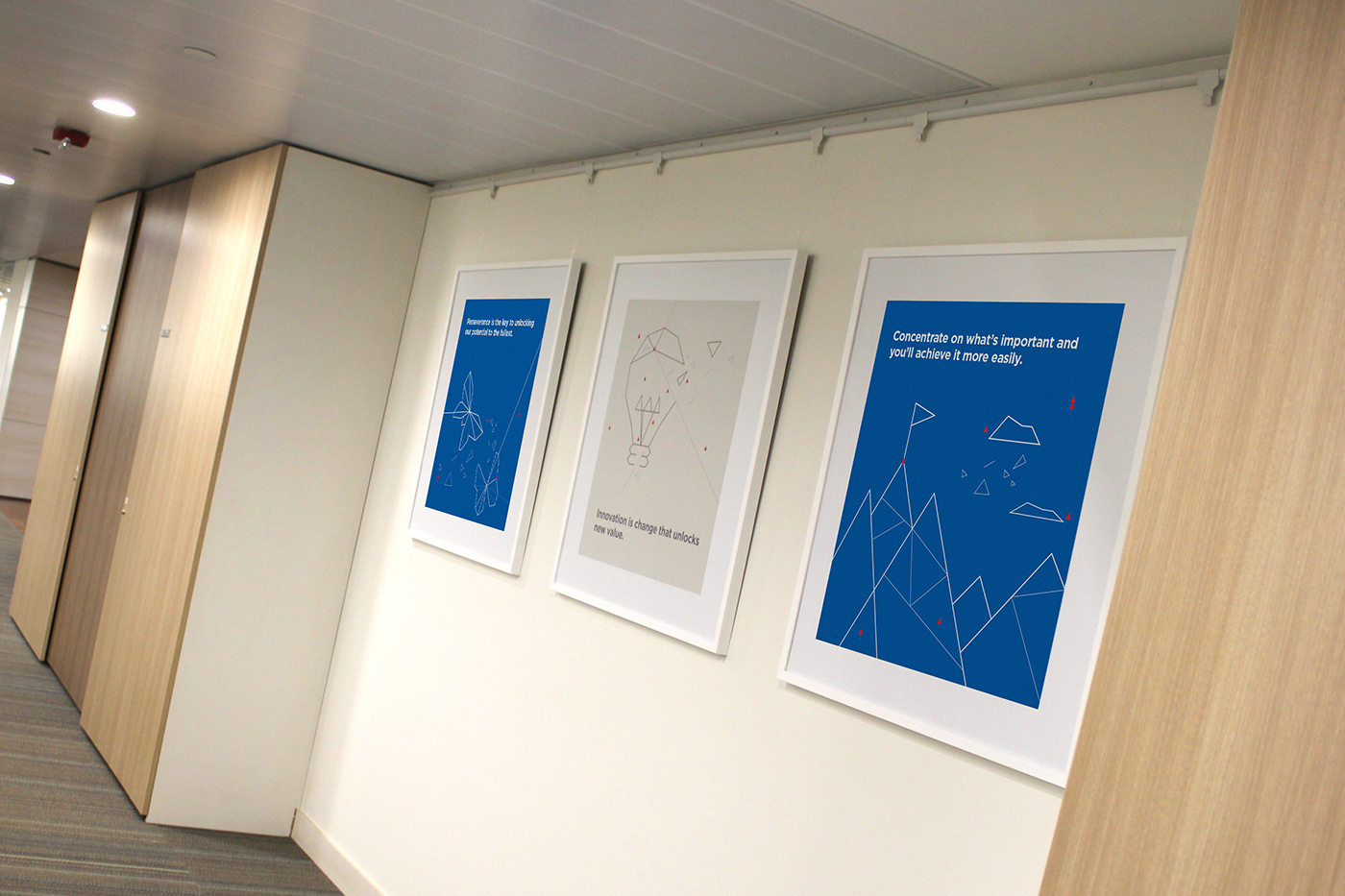
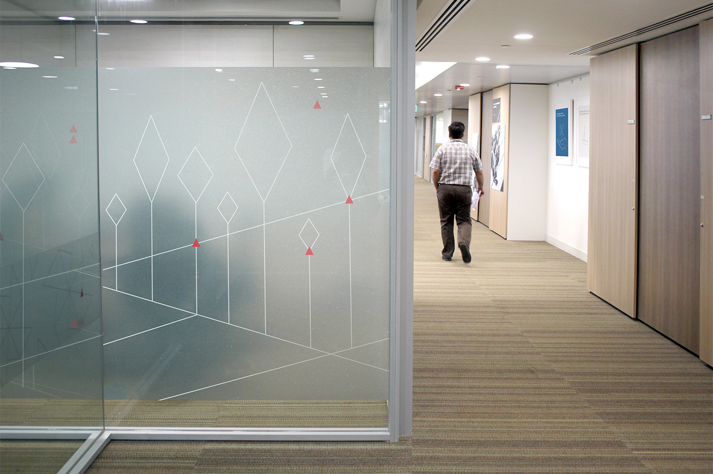
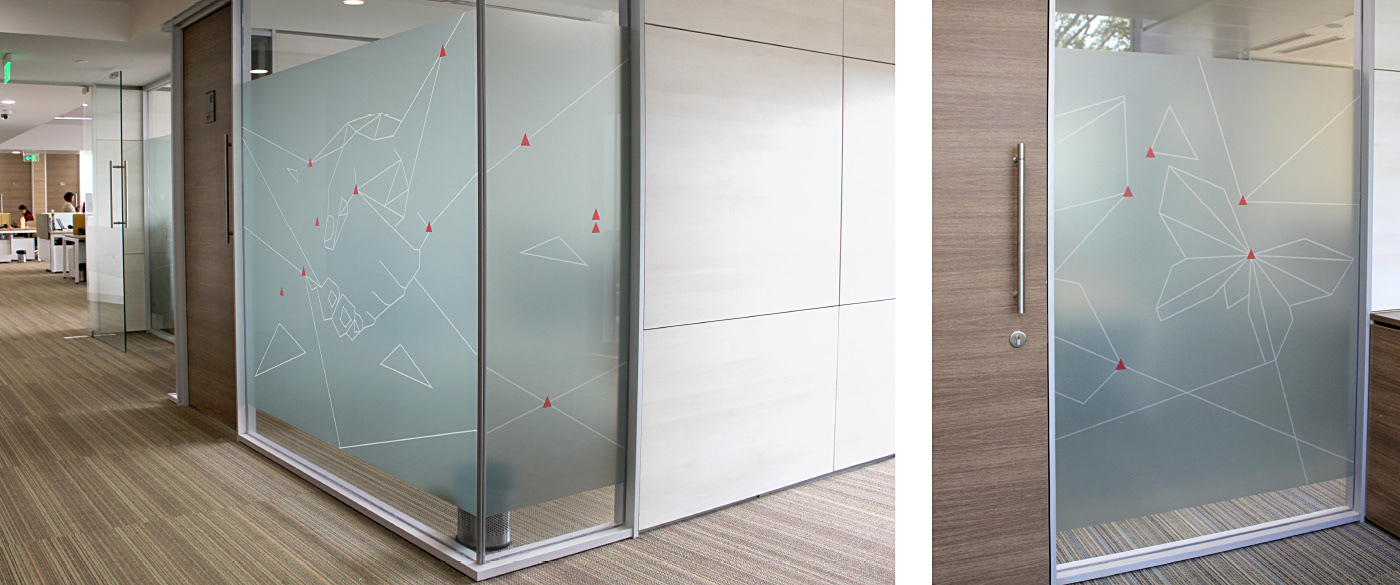
Growth, Progress, Confidence and Aspiration are the timeless pillars of Reliance ADAG – and we honoured them in our designs as well. We took a visual route that depicts singular forms created out of smaller diverse shapes. It intends to unite, and inspire several entities to come together as one force.
Creative Interpretation
We communicated the Reliance values, vision and beliefs through metaphorical illustrations within the visual language boundaries. We interpreted the Reliance brand colours to give them an individual identity, and create the core for all environmental elements.

Inspire
An inspired environment keeps the employees positive, productive and peaceful. By using motivational and inspirational quotes by influential people and supporting with relevant inspiring imagery, we achieved an inspirational tonality throughout. We stayed diverse, but used a consistent tone of voice.

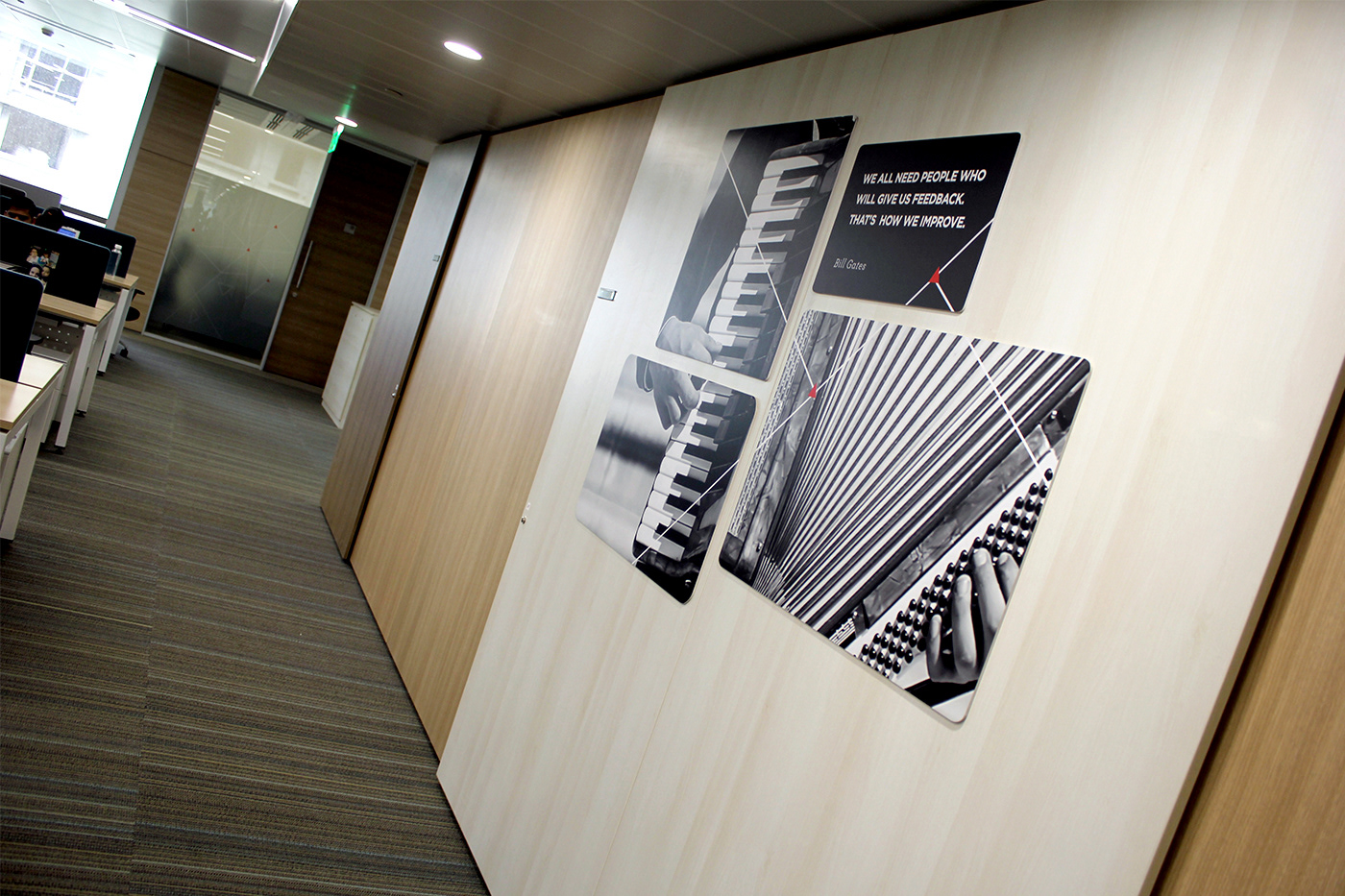

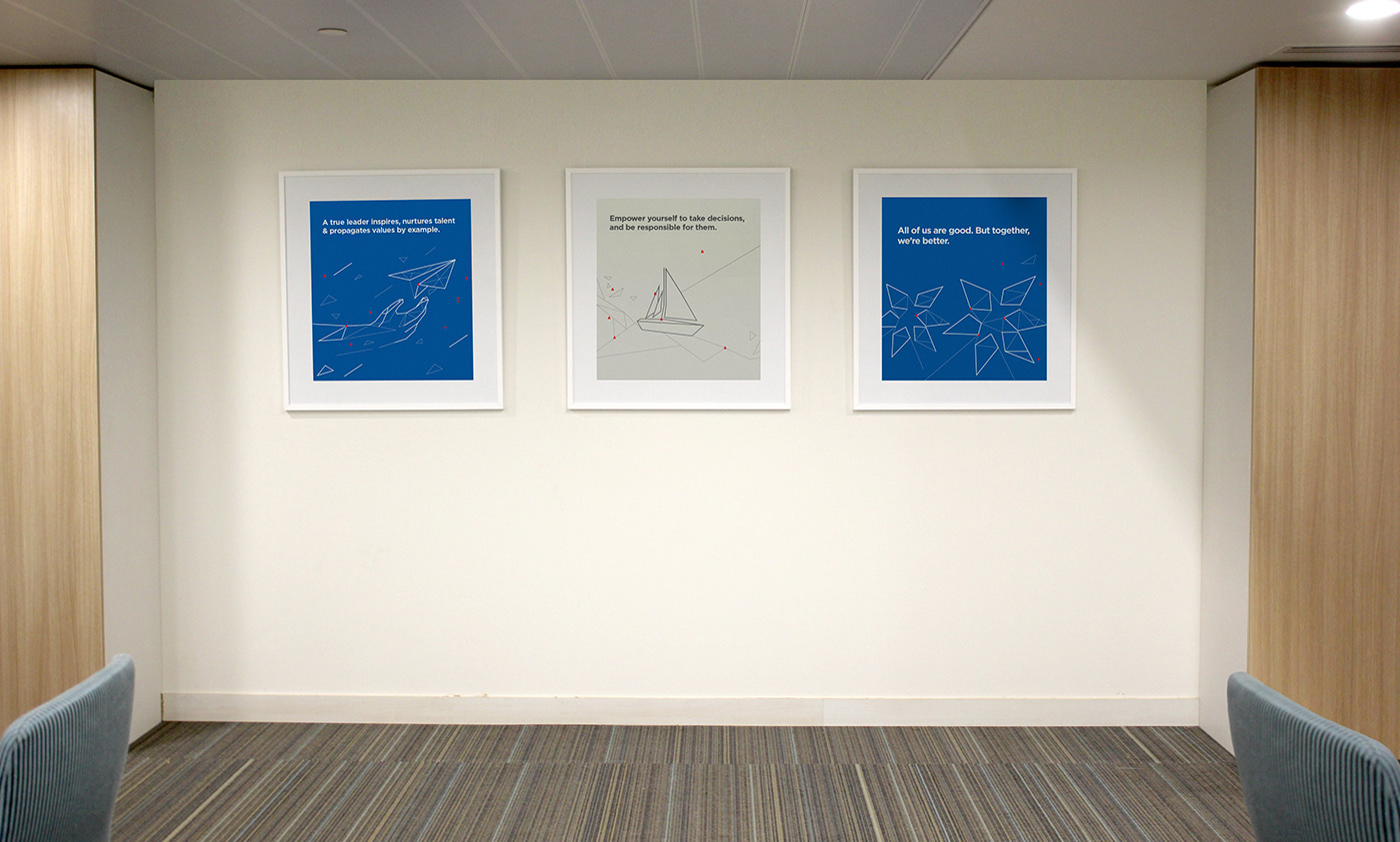
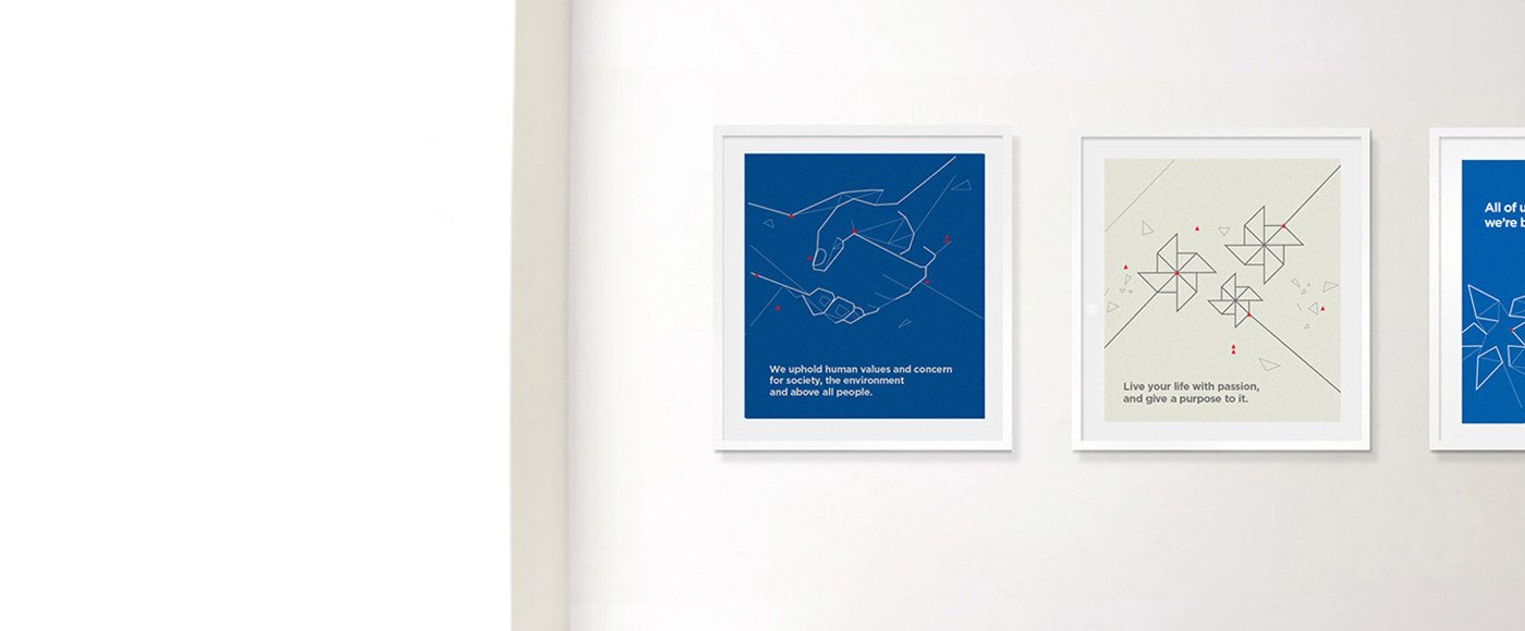
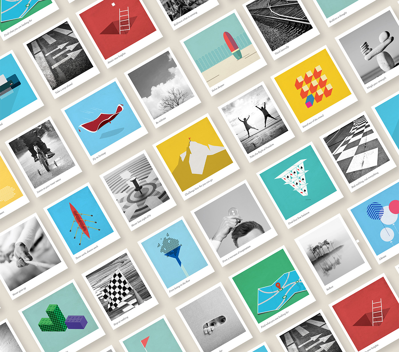
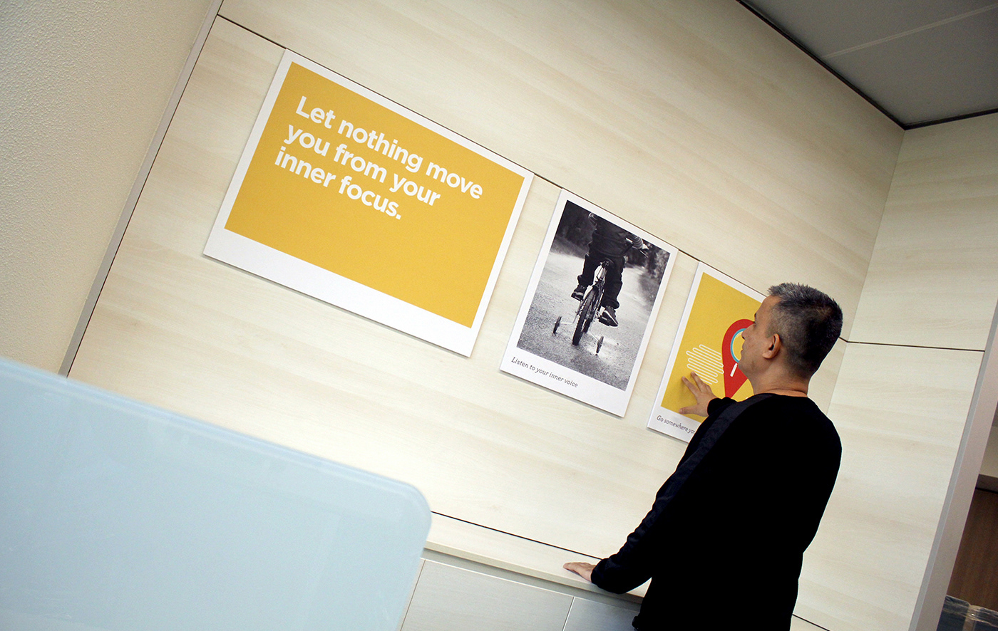
Poloroid Cubicles
With a creative twist on a simple idea of Polaroid photographs, we communicated a world of motivation as seen from different perspectives. We took business values, life principles, timeless truths, and conveyed them through metaphoric or symbolic visuals to evoke different emotions that would trigger actions. We crafted a great and variable mix of text, photographs and graphics to keep it interesting. In terms of material, we chose thin frames to create an illusion of the frames floating upon the walls


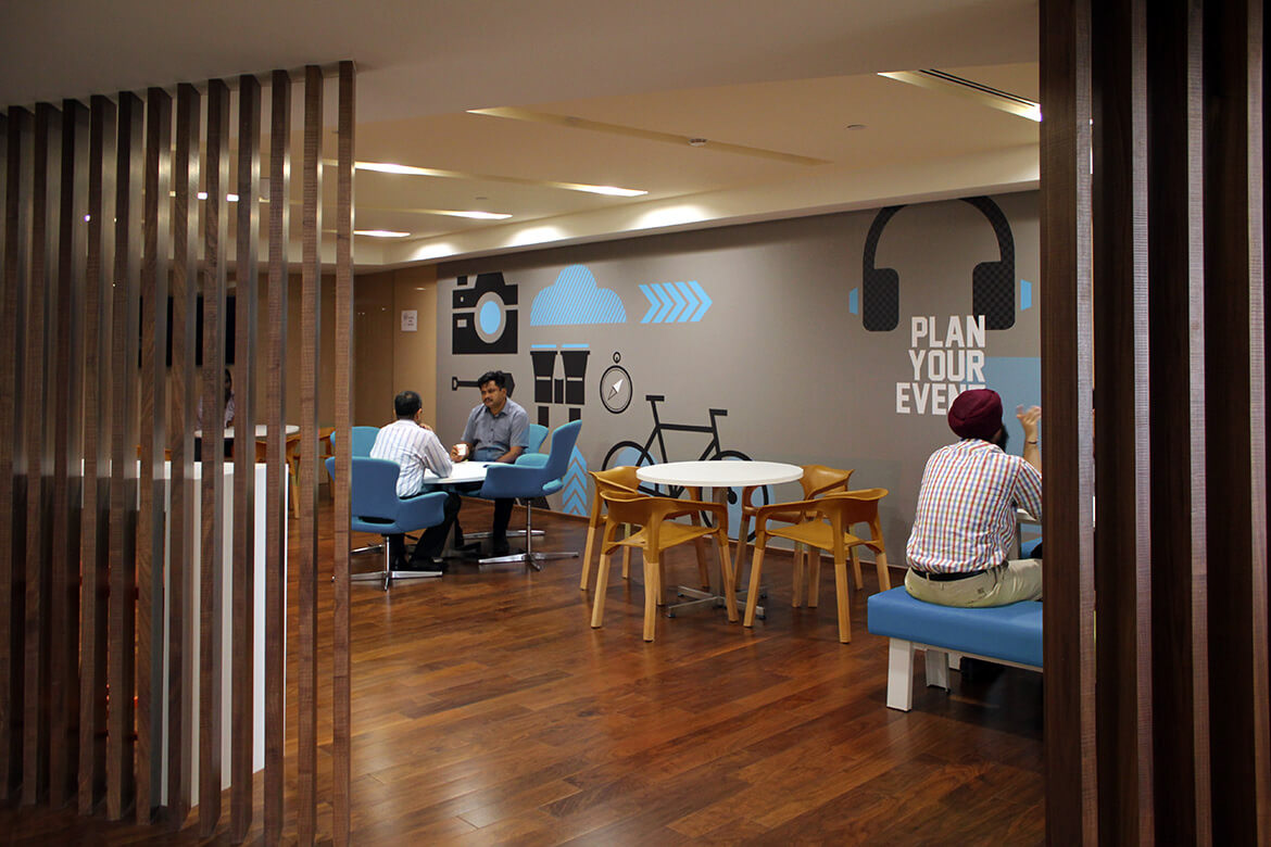
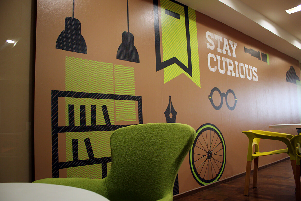
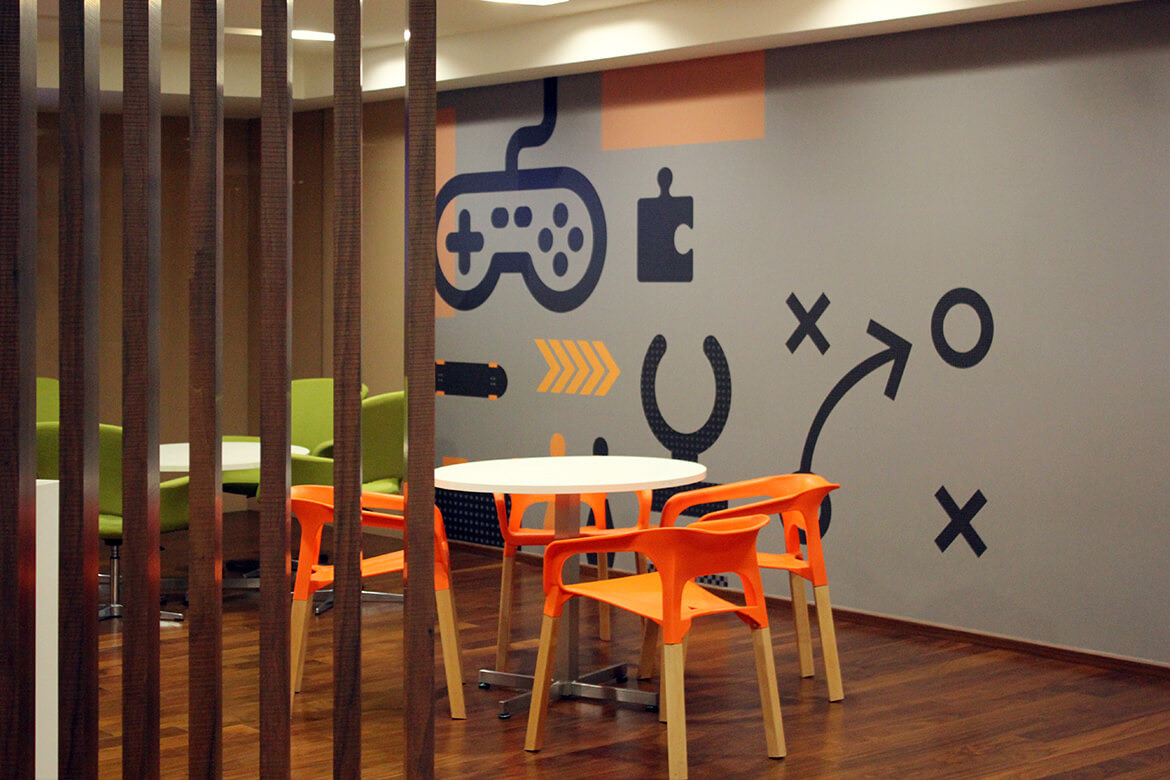
Breakout Zone
This aspect was all about creating a mood around various recreational activities – to keep people fresh and rejuvenated in the midst of work. Filled up with fun activities such as Scrabble, music, lego and more, these break out zones are now popular areas to relax, take a break or just get some personal space.

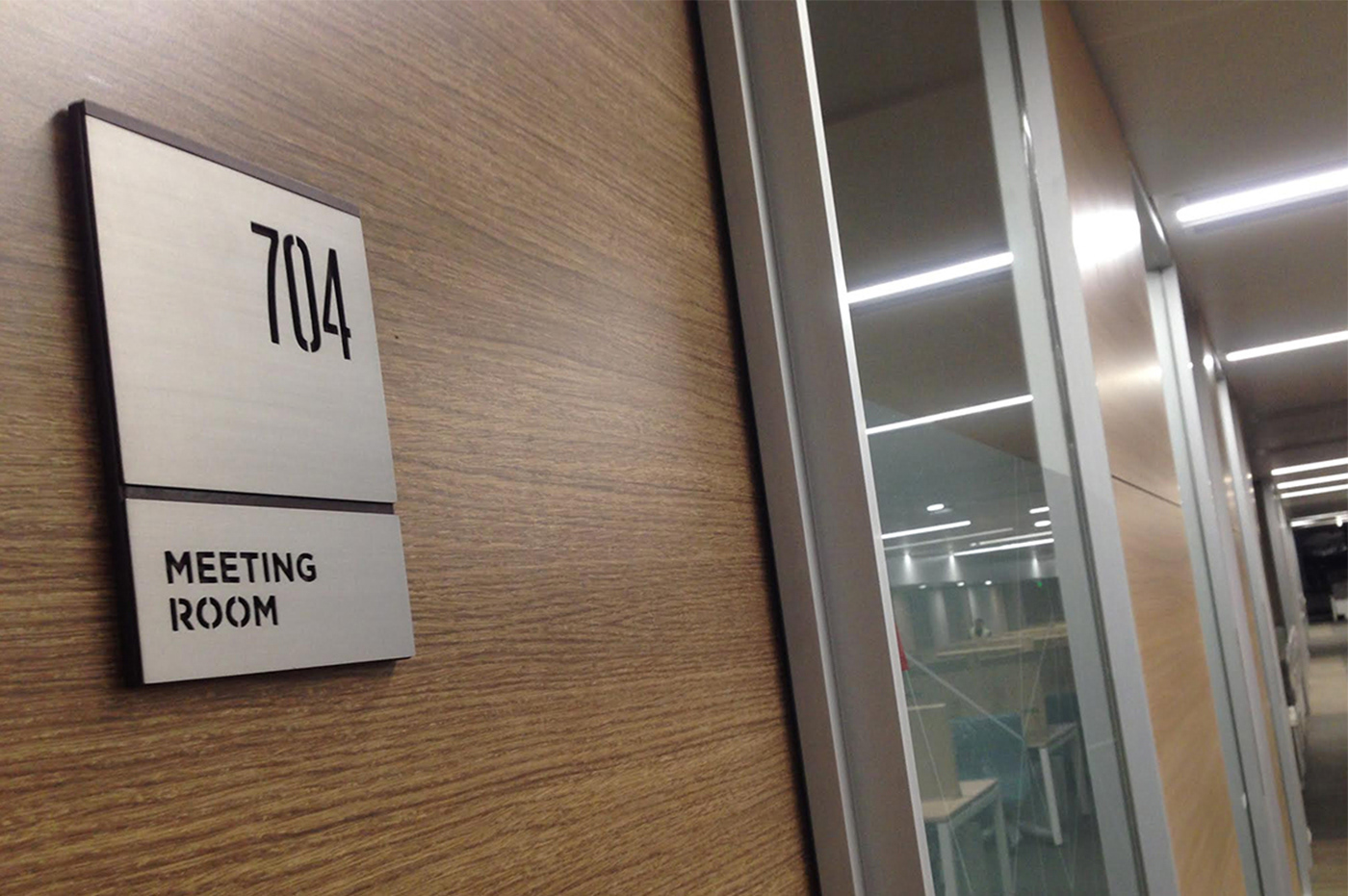
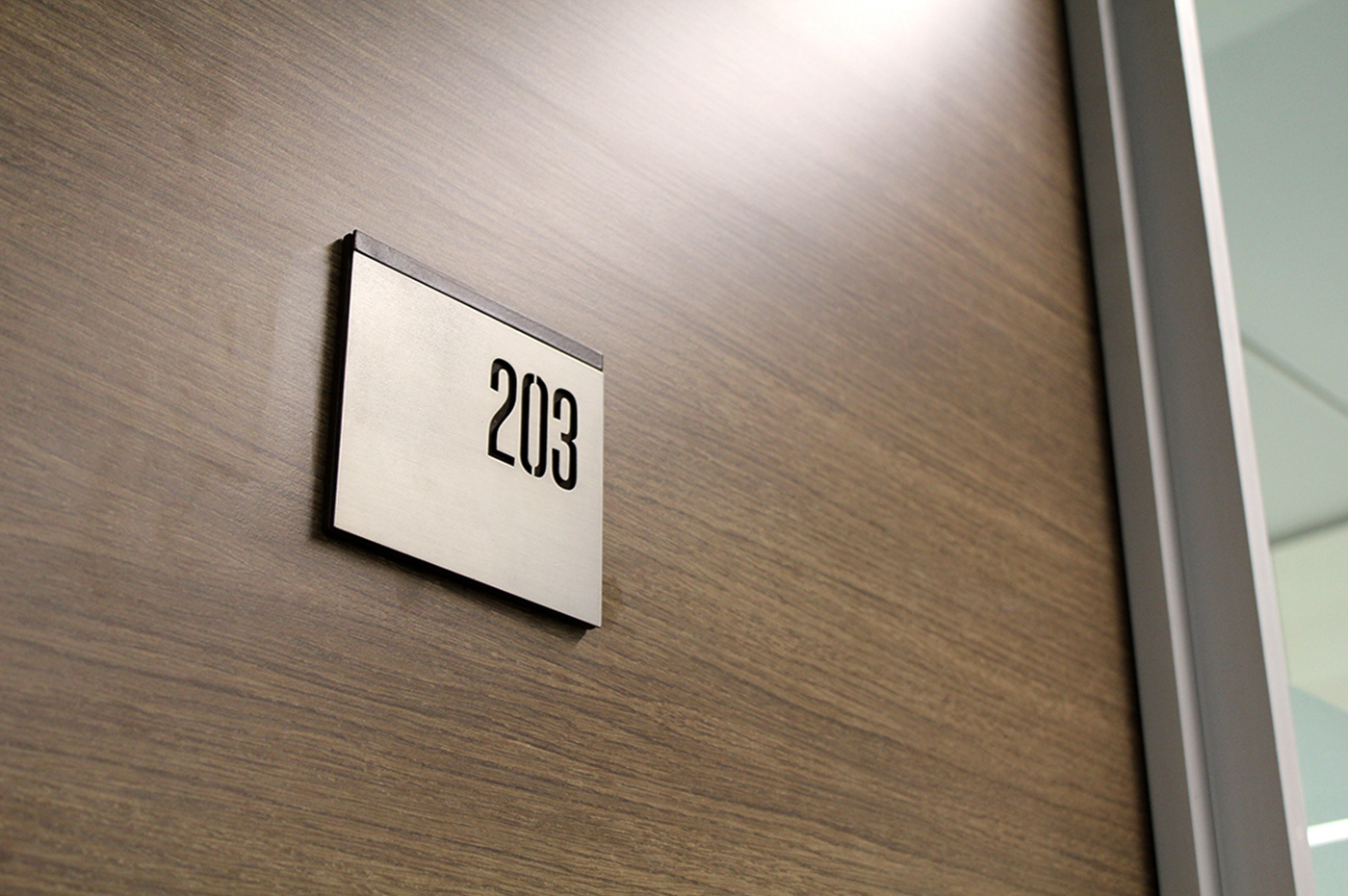
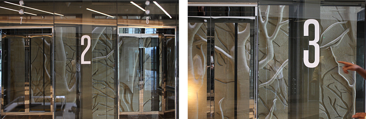
Signage
The signage extended the visual route, while enhancing class and staying functional. A great mix of brushed metal, Plexi glass and wood was brought in to further depict the diversity. [ Brand Logo Installation: Shakti Parmar & Associates, Edifice Consultants ]